
Using the page editor
When you open a page, the editor shows it as it will look on your site. You build the page from blocks (a heading, a paragraph, a picture, a row of buttons…) and change each one in the panel on the right.
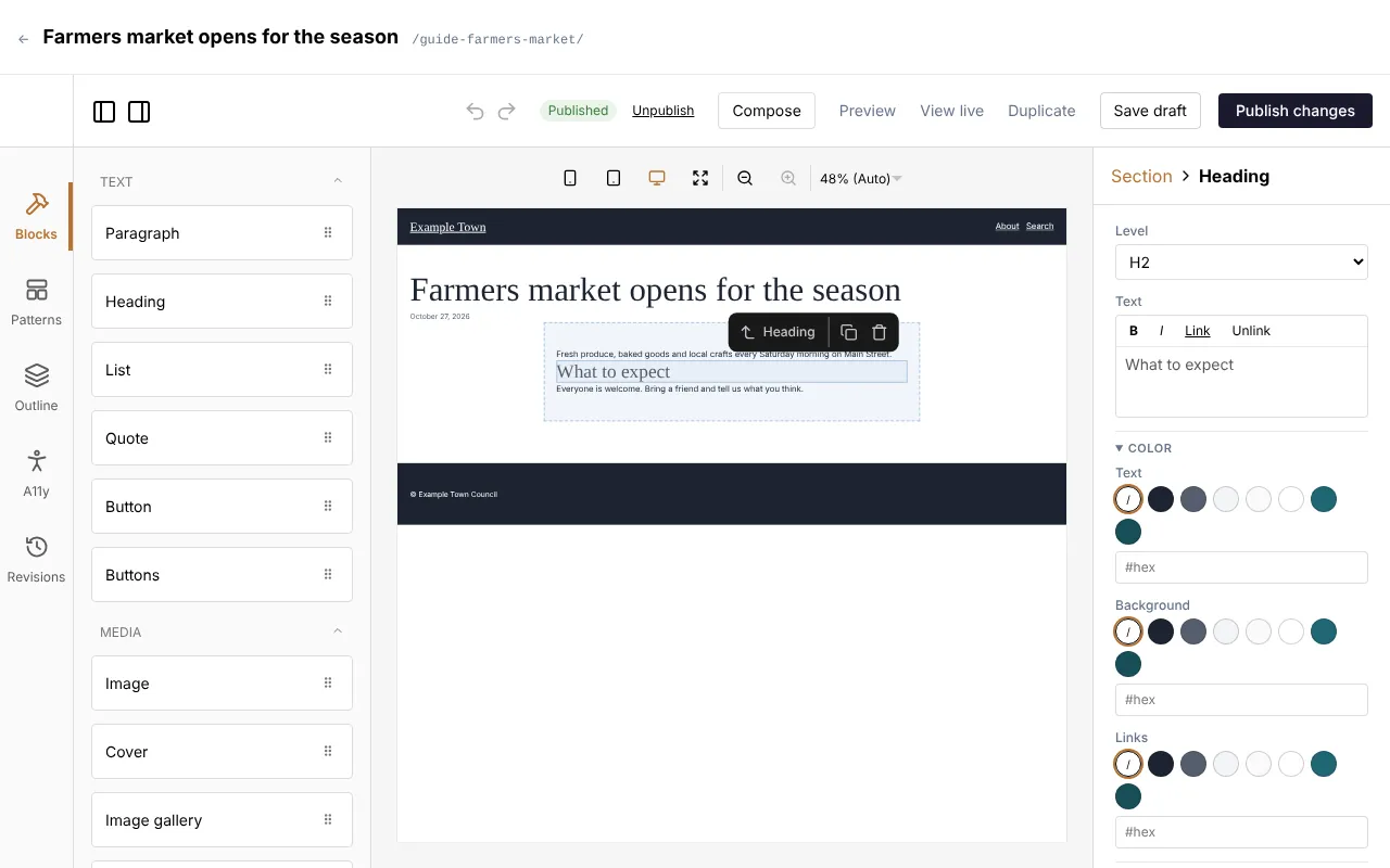
The editor’s layout
Section titled “The editor’s layout”The editor has four parts.
Along the top
Section titled “Along the top”The bar above the editor shows the page’s title and its address. The ← at its left goes back to the list the page is in.
The toolbar under it has:
- Published or Draft: whether the page is on the site, and Unsaved changes or Unpublished changes when there are some.
- Discard changes and Unpublish, on a published page.
- Compose: opens Claude beside the page (see Writing with Claude).
- Preview: the page as it will look, including changes you haven’t saved.
- View live: the published page, in a new tab.
- Duplicate: makes a draft copy of the page and opens it.
- Save draft and Publish (or Publish changes).
Saving, publishing, previewing and going back to an earlier version are explained in Saving and publishing.
The undo and redo arrows are in the toolbar too.
The left rail
Section titled “The left rail”The icons down the left side open:
- Blocks: every block you can add, in groups (see Every block below). Click a group’s name to fold it away or open it again.
- Patterns: ready-made groups of blocks (see Patterns).
- Outline: a list of everything on the page, showing what sits inside what. Click a line to select that block. This helps when a block is hard to click on the page itself. Each line also has a copy icon (Duplicate) and a bin icon (Delete).
- A11y: an accessibility check of the page (see Accessibility).
- Revisions: earlier versions of the page (see Saving and publishing).
The page in the middle
Section titled “The page in the middle”The middle shows the page as visitors will see it, with the header, footer and anything else its template puts around it. Click a block to select it.
Buttons above the page switch it between phone, tablet and desktop widths, and zoom in or out, so you can check how it looks on a small screen.
Only the page’s own content can be changed here. The header, footer and other parts that come from the template are shown so you can see the whole page, but you can’t select them (see The header, footer and templates).
The panel on the right
Section titled “The panel on the right”The right-hand panel shows the settings of the selected block, under its name. With no block selected, it shows Page settings: the page’s title, address, featured image, categories, tags and so on (see The page’s settings).
At the top of the panel, the names of the blocks it sits inside are buttons: click one to select that block instead, or click Page to go back to the page’s settings.
Working with blocks
Section titled “Working with blocks”Adding a block
Section titled “Adding a block”- Open Blocks on the left.
- Drag the block you want onto the page, to where it should go. A line shows where it will land.
- Let go. The new block is selected and its settings show on the right.
Blocks that hold other blocks (such as Section and Columns) show an empty space you can drop blocks into.
Changing a block
Section titled “Changing a block”Click the block on the page. Its settings appear on the right. Change them there: the page updates as you type. Text is written in the boxes on the right, not on the page itself.
Moving, copying and removing a block
Section titled “Moving, copying and removing a block”When a block is selected, a small toolbar appears above it with its name and three buttons:
- Select parent: selects the block it sits inside (handy for getting from a paragraph to the section around it).
- Duplicate: puts a copy of the block (and everything in it) straight after it.
- Delete: removes the block and everything in it.
To move a block, drag it on the page to its new place. A line shows where it will land; you can drop it into another section or column too.
Keyboard shortcuts
Section titled “Keyboard shortcuts”| Keys | What they do |
|---|---|
| Ctrl+Z (Cmd+Z on a Mac) | Undo the last change. Press again to undo more. |
| Ctrl+Shift+Z or Ctrl+Y (Cmd+Shift+Z or Cmd+Y on a Mac) | Redo what you undid. |
| Delete or Backspace | Removes the selected block (not while you are typing in a box). |
Blocks inside blocks
Section titled “Blocks inside blocks”Some blocks hold other blocks:
- Section: a band across the page, with its own background and spacing.
- Columns and Column: blocks side by side.
- Buttons: a row of Button blocks.
- Quote: the quoted words, as Paragraph blocks.
- Cover: blocks laid over a picture.
- Media & text: blocks beside a picture.
- Image gallery and Video gallery: their pictures and videos.
- Collection: the card repeated for each entry.
- Members only: blocks only members see.
Drag blocks into them. The Outline shows how everything is nested.
To put blocks side by side:
- Add a Columns block.
- Drag a Column block into it for each column you want.
- Drag your blocks (a heading, a paragraph, a picture) into each Column.
On phones the columns stack one under the other, unless you tick Keep side by side on phones in the Columns settings.
Styles
Section titled “Styles”Most blocks share the same style settings, near the end of their panel. Groups can be folded away by clicking their heading. Which groups a block has depends on the block.
- Width: Default, Wide or Full width. Inside a section that keeps its content to a reading width, Wide lets the block spread wider and Full width takes it from edge to edge.
- Color:
- Text, Background and Links. Click one of the site’s colours, the / circle to go
back to the default, or type a colour code (such as
#1a1a2e) in the box.
- Text, Background and Links. Click one of the site’s colours, the / circle to go
back to the default, or type a colour code (such as
- Text (for blocks with words):
- Size: one of the site’s text sizes.
- Font: the site’s display font or its body font.
- Weight: Light, Regular, Medium, Semibold or Bold.
- Alignment: Left, Center or Right.
- Case: Uppercase or As typed.
- Letter spacing and Line height: type a value, such as
0.06emor1.6.
- Spacing:
- Padding top, Padding right, Padding bottom and Padding left: space inside the block, between its edge and its content.
- Margin top and Margin bottom: space outside the block, between it and its neighbours.
- Each is None, one of the site’s spacing sizes, or Custom (type a value such as
2rem).
- Border: Corner radius (how round the corners are, such as
6px), Border width (such as1px) and Border color. - CSS class: a name your site’s designer may give you for a special style. Leave it empty otherwise.
Every setting left empty uses the site’s own style, so a block looks right without any of them.
Layout inside a block
Section titled “Layout inside a block”Section, Cover and the Page content block have a Layout group that sets how the blocks inside them are arranged:
- Arrange children:
- Stacked: one under the other, as wide as the block.
- Stacked, centred content width: one under the other, kept to a comfortable reading width in the middle. New sections start like this. Content width then sets that width: Standard (720px), Narrow (560px), Reading (640px), Medium (800px), Large (960px), Extra large (1120px), Wide (1280px) or Full width.
- Row: side by side. Justify (Start, Center, End, Space between), Align (Top, Center, Bottom, Stretch) and Wrap onto new lines set how they sit.
- Column (flex): one under the other, with the same Justify and Align settings.
- Grid: in a grid. Columns sets how many (empty: as many as fit), and Minimum column
width how narrow a column may get (such as
12rem).
- Gap between children: the space between the blocks inside.
Copying a block’s look
Section titled “Copying a block’s look”To make one block look like another:
- Select the block whose look you like.
- Scroll to the end of its settings and click Copy styles.
- Select the other block and click Paste styles (the button names the kind of block you copied from).
Its colours, spacing, text style, borders and width change to match; its words and pictures stay as they are. Between two blocks of the same kind (two sections, say) the layout comes too: alignment, gaps, height, overlay, size, columns and display.
The copy stays in your browser, so you can paste it on another page, a template or a pattern. Changed your mind? Click undo.
Blocks inside a linked pattern don’t offer Copy styles: their look belongs to the pattern.
Advanced settings
Section titled “Advanced settings”Every block’s settings end with Advanced: all attributes (JSON), which shows all of its settings as code. It is there for people who know what they are doing; you never need it for ordinary editing.
Writing and formatting text
Section titled “Writing and formatting text”Text boxes for paragraphs, headings, captions and list items have a small toolbar above them:
- B: bold.
- I: italic.
- Link: link the selected words (see Links).
- Unlink: take the link off the selected words.
Select some words first, then click the button.
There are two places to make a link:
- In text: select some words in a text box and click Link above it.
- In a link box, such as a button’s Link, a Hero’s Button link or a menu item’s link: click Find beside the box. You can also type or paste an address straight into the box.
Both open the same link picker, with a box that says Search pages, or paste a link:
- To a page on your site: start typing its title and pick it from the list (use the arrow keys and Enter, or click it). Each result shows its kind, its address, and (not published) if it is a draft. With the box empty, the list shows the pages edited most recently.
- To a file: click Media library and pick a picture, a document or a video.
- To another website: paste its full address (such as
https://example.org) and pick Link to this address. A plain domain such asexample.orggetshttps://added. - An email address or phone number: type it (a phone number without spaces) and pick Link to this address. The link opens an email or a phone call.
- A part of the same page: type
#and the part’s name.
If nothing is found, the picker says Nothing found. Type a full address (https://…) to link to another site. Cancel (or the Escape key) closes it without linking.
In text, a few more things apply:
- Open in a new tab is ticked for links to other websites and unticked for your own pages. Change it if you want.
- If no words are selected, the link is added with the page’s title or the file’s name as its words.
- To change a link, put the cursor in it and click Link again: its address is filled in, ready to change. Remove link there takes it off.
Link boxes don’t have Open in a new tab in the picker: blocks such as Button and Image have their own Open in a new tab setting.
Every block
Section titled “Every block”These are the blocks as the Blocks list groups them. Some groups only appear when your site uses that feature, and some blocks only appear on the kinds of content they work with (an event’s blocks on events, for example). Templates offer every block.
Your site may also have blocks of its own, made for its design; they appear in these groups too.
| Block | What it’s for | Its settings |
|---|---|---|
| Paragraph | Ordinary text. | Text (with bold, italic and links), and the Color, Text and Spacing styles. |
| Heading | A title for a section of the page. | Level: H1 to H6 (see the tip below). Text. The Color, Text and Spacing styles. |
| List | Bullet points, numbered steps or a list with icons. | Marker: Bullets, Numbers, Icon or None. With Icon: the Icon to use and its Icon color. Items: each item’s text, with Up, Down and Remove; with icons, Icon for this item gives one item a different icon. Add item adds one; Paste several takes a list, one item per line, and Add lines adds them all. Under Text: the text styles and Space between items. |
| Quote | Words quoted from someone. Put Paragraph blocks inside for the quote itself. | Citation: who said it. All the styles. |
| Button | One link styled as a button, such as “Book now”. Put it inside a Buttons block. | Label: the words on it. Link (with Find). Open in a new tab. Style: Default or Outline. Width: 25%, 50%, 75% or 100% of the space. The Color, Text and Border styles. |
| Buttons | A row of Button blocks. | Justify: Start, Center, End or Space between. Stack vertically. Gap between the buttons. |
Pictures, galleries, videos and documents are covered in more depth in Images and files.
| Block | What it’s for | Its settings |
|---|---|---|
| Image | One picture. | Image: Choose (or Replace) picks one from the media library; Edit opens it in the media library in a new tab. Alt text (describes the image). Caption. Link and Open link in a new tab. Placement: Float left, Float right (text wraps round it), Centred, Wide or Full width. Image size: Full (the original), Large (1024px), Medium (768px), Small (300px) or Thumbnail (150px square). Aspect ratio: Original, or a shape such as Square (1:1) or Wide (16:9). Fit: Cover (crop to fill) or Contain (show the whole image). Circle. Fill the block behind the content: the picture fills the block it is in (such as a card), behind the rest. Shade (darker towards the bottom). Focal point when it is cropped (see below). The Spacing and Border styles. |
| Cover | A picture with blocks laid over it, such as a heading and a button. | Image. Use the page’s featured image instead. Alt text. Focal point. Overlay color and Overlay: Even, From bottom or From left (a gradient keeps the text readable where it sits and leaves the rest of the picture clear). Overlay opacity: how dark, from 0 to 100%. Minimum height (such as 430px). Content position: where the blocks sit, from Top left to Bottom right. Dark text (light image). The Layout group and the styles. |
| Image gallery | Several pictures as a grid, masonry columns or a slider. | See Galleries. Display, Add images, Columns (or Visible at once in a slider), Image shape, Crop images to fit, Gap, and the Style and Slider groups. |
| Video gallery | Several videos together. | As the image gallery, with Add uploaded videos and Add YouTube or Vimeo links (one link per line, then Add links). |
| Media & text | A picture beside some text. Drag blocks into the text side. | Image. Image side: left (Default) or Right. Image width (%) (50 if empty). Text position: Top, Middle or Bottom. Stack on phones. The styles. |
| Embed | Something from another website, such as a YouTube or Vimeo video. | URL: its address. Embed HTML: code another website gives you to paste. Aspect ratio: Provider’s size or a shape. |
| Video | A video file from the media library. | Video: Choose one from the media library. Or a video file’s address. Poster image (shown before it plays), and Remove the poster. Caption. Autoplay (muted). Loop. Show controls. |
| File | A document (a PDF, say) with its type, size and a Download button. | File: Choose opens the media library on your documents; Edit opens the file in the media library. Or an address: a document elsewhere. Link text (the file’s title if empty). Show its type and size. Button: its words (Download); empty for no button. The Color and Spacing styles. |
Layout
Section titled “Layout”| Block | What it’s for | Its settings |
|---|---|---|
| Section | A band across the page that holds other blocks, with a background colour and spacing. | Element: what kind of area it is for screen readers (such as header, footer or main); usually leave it at Default. The Layout group. All the styles. |
| Columns | Puts Column blocks side by side. | Gap between the columns. Vertical alignment: Top, Middle or Bottom. Keep side by side on phones. The styles. |
| Column | One column inside Columns. | Width: such as 33.33% (empty: the columns share the space). Vertical alignment: Top, Middle, Bottom or Stretch. Gap between blocks. The styles. |
| Spacer | Empty space between blocks. | Height: such as 40px. |
| Separator | A line between parts of a page. | Style: Default, Full width line or Dots. The Color and Spacing styles. |
| Global | Content kept in one place and shown on many pages: change it once, and every page shows the change. | Global: which one. Edit this global opens it in a new tab. |
| Site title | The site’s icon and name, linking to the home page (usually in the header). | Icon and Name: whether to show each. Before the name: words in front of it, such as “Welcome to “. |
| Navigation | The site’s menu (usually in the header). Its links are changed under Settings, Menu by an admin (see Settings and the menu). | Search button. Name for screen readers (such as “Primary”). |
| Social links | Icons linking to the site’s social media profiles. The profiles are set under Settings, Social by an admin. | Icon size (px). Alignment: Left, Center or Right. Show the network names. The styles. |
Lists and listings
Section titled “Lists and listings”| Block | What it’s for | Its settings |
|---|---|---|
| Collection | An automatic list of your posts, events or other content, each shown as a card. | See Collections below. |
| Filters | A search box and a dropdown of categories (or another way of sorting) above a listing, such as a category page. The list updates as visitors use them. | Search box, its Search placeholder and Suggestions as you type. Filter by: which kind of term. Dropdown placeholder. Show the count. Under Addresses: Search parameter and Filter parameter, the names used in the page’s address (only change these to keep older links working). |
| Map | A map with a pin for each entry of a kind that has a location. Each pin links to its entry. | Show: which kind of content. Follow the Filters block’s: which kind of term, so the map follows a Filters block on the page. Only featured entries until filtered. Center (latitude, longitude) (empty: every pin in view). Zoom (1-19). Height. Under Fields: Latitude field, Longitude field, Address field (popup) and Leave out when this field is on (ask whoever set up your site which to use). |
| Search | A search box that leads to the site’s search page. | Placeholder: the words shown in the empty box. Button text. Label, and Show the label. The styles. |
| Events calendar | Upcoming events as a month calendar or a list, on any page. | See Events and tickets. Title, Shows first (Calendar or List), Events in the list, Categories (any of) and Tagged with (any of). |
| Events page (list, month, day) | The full events listing, with its month and day views. Usually only in the events template. | No settings of its own. |
| Listing title | The name of the listing a page shows, such as a category’s name, on category pages and other listings. | Show the prefix (e.g. ‘Member Category:’). The styles. |
Card fields
Section titled “Card fields”These show one piece of an entry. They are mostly used inside a Collection’s card, where each card shows its own entry’s, and in templates, where they show the page’s own.
| Block | What it’s for | Its settings |
|---|---|---|
| Title | The entry’s title. | Level: Paragraph or H1 to H6. Link to the entry and Open in a new tab. The styles. |
| Featured image | The entry’s featured image. | Link to the entry and Open in a new tab. Aspect ratio. Height: Default, Auto (the image’s own height), Small, Medium, Large, Extra large or Custom. In a card, Default is Medium (240px), cropped to fill the card’s width. Fit. Image size. Fill the card behind the content (give the card a minimum height). Shade (darker towards the bottom). Overlay: how dark, from 0 to 100%. The styles. |
| Excerpt | The entry’s short summary. | Word limit (55 if empty). Read more text. The styles. |
| Date | When the entry was published. | Date format (see the note below). Last updated date instead. Link to the entry. The styles. |
| Event date | An event’s date and time. | Date format (PHP). |
| Categories | The entry’s terms of one kind, such as its categories or tags. | Taxonomy: which kind. Separator: what goes between them (a comma if empty). The styles. |
| Field | Any other piece of information the entry has, such as a phone number or website. | Field: its name (ask whoever set up your site). Show as: Text, Web link, Email link, Phone link or Image. Label before it. For links, Link text and (web links) Open in a new tab. |
Sections
Section titled “Sections”| Block | What it’s for | Its settings |
|---|---|---|
| Hero | A large picture across the top of a page, with a title, some text and up to two buttons. | Image. Focal point. Overlay (keeps the text readable): None, Light, Medium or Strong. Darkest at: Bottom, Left or All over. Eyebrow: a short line above the title. Title. Text. Button label and Button link; Second button label and Second button link (leave a label empty for no button). Height: Full screen, Large or Medium. Title is the page’s main heading (h1): untick it if the page already has one. |
| Form | One of your forms. | Form: which one. Show the form title. Show the form description. Form style (see below). |
These come with events and tickets, and show only while your site uses them. See Events and tickets.
| Block | What it’s for | Its settings |
|---|---|---|
| Event details | An event’s page: its picture, title, description, date, venue and ticket form. Only on events. | No settings of its own. |
| Event schedule | An event’s schedule. Only on events. | No settings of its own. |
| Tickets | The booking form for a ticket, on any page. | See Selling tickets. Ticket, Date and Heading. |
Members
Section titled “Members”Shown only while your site has members (an admin turns them on: see Turning features on).
| Block | What it’s for | Its settings |
|---|---|---|
| Members only | Blocks only members (and editors) see. Put blocks inside it. Everyone else sees a message and a sign-in link. | Members of (none ticked: any level). Show nothing to everyone else. Message for everyone else. |
| Member account | Signing in, creating an account and resetting a password; once signed in, the member’s details and Sign out. | No settings of its own. |
| Member sign-in link | A link to the account page that reads “Sign in”, or “My account” once signed in. | Label and Label when signed in. |
Mailing Lists
Section titled “Mailing Lists”Shown only while your site has mailing lists (an admin turns them on: see Turning features on). Everyone who signs up gets an email with a link to confirm.
| Block | What it’s for | Its settings |
|---|---|---|
| Newsletter signup | A compact sign-up for one list, for a band or the footer. | List. Heading and Text (clear them to leave them out). Button. Inside the email field. Consent wording. Tag sign-ups with (comma separated). Align: Centred or Left. Form style. |
| Subscribe | A sign-up form for one or more lists. | Lists offered (none ticked: every public list). Heading, Text, Button. Consent wording. Tag sign-ups with (comma separated). Ask for first and last name. Also ask (optional for visitors): extra details. Form style. Layout: Stacked or In a row. |
| Email preferences | Where people who follow a link from one of the site’s emails confirm, choose their lists or unsubscribe. | Shows first: Email preferences or Unsubscribe. |
Advanced
Section titled “Advanced”| Block | What it’s for | Its settings |
|---|---|---|
| HTML | Your own HTML code, put on the page exactly as written. | HTML. |
| Template part | A shared part, such as the header or footer, placed in a template. | Part: which one. |
| Page content | In a template: where each page’s own content goes. | Content area (see Content areas). The Layout group. |
Form style
Section titled “Form style”The Form, Subscribe and Newsletter signup blocks have a Form style group (closed at first: click it to open). Fields are white with black text unless you change them. Every setting left empty keeps the default.
- Form background (default none), Form border (default none) and Form text (heading, intro, small print). A background or border puts the form in a box.
- Field background (default white), Field text (default black), Field border, Labels, Placeholder text, Field being typed in (border and ring) and Checkboxes and radio buttons.
- Button background and Button text.
- Field height: Normal, Compact or Large.
- Field text size: Normal, Small or Large.
- Field border width: Thin (default), None, Medium or Thick.
- Field corners and Button corners: Default, Square, Slightly rounded, Rounded or Pill.
Collections
Section titled “Collections”A Collection lists your content automatically: the latest posts on the home page, upcoming events, a team. Its settings are in groups.
Content
- Show:
- Latest: the newest entries of some kinds. Tick the Content types to include. Then you can
narrow it to some categories (each kind of term has its own list, such as Categories (any of))
or Tagged with (any of), and choose:
- Upcoming events only (soonest first), when only events are ticked.
- Featured only, for content that can be marked featured (an admin turns this on: see Featured content).
- Order: Newest first, Oldest first, Title A to Z, Title Z to A, Manual order or Random.
- How many (10 if empty) and Skip the first (to leave out ones shown elsewhere).
- Hand-picked: the entries you choose. Under Entries, in order, type two or more letters in Search to add and click an entry to add it. They show in the order of the list: ↑ and ↓ move one up or down, and Remove takes one off.
- Page’s list: whatever the page is showing, such as a category’s entries or search results. Used in templates for listing pages.
- Latest: the newest entries of some kinds. Tick the Content types to include. Then you can
narrow it to some categories (each kind of term has its own list, such as Categories (any of))
or Tagged with (any of), and choose:
- Shuffle on each visit: a different random set (or order) each time someone visits.
Layout
- Display: Grid, List or Slider.
- Columns (in a slider, Per view), and for a grid, how many on a Tablet and a Phone.
- Space between cards.
- Cards in a row as tall as the tallest (grids).
Card
- Card design: one of your site’s card designs, or Custom (edit the card’s blocks). With a design chosen, each entry’s card is made for you. To change the card yourself, choose Custom, then select a block inside the first card on the page: every card follows.
Paging (not for sliders)
- Pagination: None, Page numbers, Previous and next or Load more button.
- Message when there is nothing to show.
Appearance: the usual styles.
Focal points per screen size
Section titled “Focal points per screen size”The Hero, Cover and (when it is cropped) Image blocks show only part of their picture, and that part changes with the screen’s shape. To choose which part stays in view:
- Select the block and find Focal point in its settings.
- Pick Desktop, Tablet or Phone.
- Click the most important part of the picture (a face, a building). The small preview beside it shows how it will be cropped on that screen.
A size you have set shows a dot after its name. A size you don’t set uses the picture’s own focal point from the media library; Use the image’s own goes back to it. See Keeping the important part in view.
Patterns
Section titled “Patterns”Patterns are ready-made groups of blocks, such as a “call to action” band or a team section, already styled to match your site.
To add a pattern:
- Open Patterns on the left. Type in Search patterns to find one by name.
- Select a block on the page if you want the pattern to go after its section; otherwise it goes at the end of the page.
- Click Insert beside the pattern.
Click a pattern’s address under its name to edit the pattern itself, in a new tab.
Copy and linked patterns
Section titled “Copy and linked patterns”A pattern is one of two kinds:
- A copy (most patterns): the blocks become the page’s own. Change anything you like; the pattern and other pages stay as they are.
- Linked (marked Linked in the list): the layout and style stay the pattern’s, and each page changes only the content. When someone edits the pattern, every page using it changes too, keeping its own content.
In a linked pattern you can’t move, remove, copy or add blocks, and each block’s settings show only its content, with a note: Part of a linked pattern: change its content here. Layout and style are set in the pattern. What you can change:
| Block | Content you can change |
|---|---|
| Paragraph, Heading | The text. |
| List items | Each item’s text. |
| Quote | Citation. |
| Button | Label and Link. |
| Image | Image, Alt text, Caption and Link. |
| Cover, Media & text | Image and Alt text. |
| Hero | Image, Eyebrow, Title, Text, and both buttons’ labels and links. |
| Embed | URL. |
| Video | Video and Poster image. |
Select the linked pattern itself (with Select parent, or in the Outline) to see where it comes from. Detach (make an ordinary copy) turns it into an ordinary copy whose blocks are the page’s own to change; later edits to the pattern then no longer reach this page.
Saving your own pattern
Section titled “Saving your own pattern”To reuse something you built:
- Select its outer block (usually a Section).
- At the end of its settings, click Save as pattern….
- Give it a Pattern name.
- Under When placed on a page, choose Copy (each page gets its own blocks to change freely) or Linked (pages change only the content; this block becomes the first use).
- Click Save pattern.
The pattern then appears in the Patterns tab on every page.
The page’s settings
Section titled “The page’s settings”Click an empty part of the page, or Page at the top of the right-hand panel, to see Page settings. What’s there depends on the kind of content.
- Title: the page’s name, shown at the top of the page and in the browser tab. While a page is unpublished, its address follows the title as you type.
- Slug: the last part of the page’s address. Only lower-case letters, numbers and dashes. Changing the address of a published page leaves the old address leading to the new one. See Page addresses.
- Template: the layout around the page. Default uses the template chosen for this kind of content (by an admin, under Settings, Types). Usually leave it as it is. A template without a place for the page’s content shows a warning, since the page’s own content wouldn’t show.
- Excerpt: a sentence or two summing up the page, shown in lists and search results. Compose under it has Claude write one from the page as it is now.
- Featured image: the picture used for this page in lists and when it is shared.
- Categories and any other ways your site sorts this kind of content: tick the ones that apply. Long lists have a box to find one. New ones are added under Content, Taxonomies.
- Tags: type a tag and press Enter (or a comma) to add it. Pick an existing tag from the list, or Create a new one. Click × on a tag to take it off.
- Details: the extra information this kind of content has, such as a phone number, a website or a Featured switch. Web address boxes have Find.
- Members (only while your site has members): Members only keeps the page for members, of all levels or the Levels you tick. Everyone else sees its title, excerpt and featured image with a sign-in link, and it is left out of lists and search for them. It applies when the page is published.
- SEO: how the page appears in Google and when it is shared.
- Search title and Meta description: the title and short description search engines show. The counter turns red past 60 and 160 characters, where search engines cut them off. Empty, they use the page’s title and excerpt.
- Compose: Claude writes both from the page as it is now. Edit the suggestion as you like.
- Under them, a preview of how the page may look in search results.
- Share image: the picture shown when the page is shared on social media. Empty, the featured image is used, then the site’s default. Remove share image clears it.
- Hide from search engines and AI answer engines asks Google and the like not to list the page, and the tools behind ChatGPT, Claude, Perplexity and Google’s AI answers not to read it. Use it for pages only your members or partners need, for example.
- Leave out of this site’s search stops the page appearing in your own site’s search (it still shows in menus and lists).
Events have more settings here (Starts, Ends, Time zone, All-day event, Repeats and Tickets): see Events and tickets.
Changes to the settings show on the page as you make them, and save with the page.
Content areas
Section titled “Content areas”Some templates have more than one place for a page’s own content, such as a main column and a sidebar. Each place is a content area. On a page using such a template, every area shows where the template puts it; an empty one says Content area: and its name, with Drop blocks here. Drag blocks into it like anywhere else. Each page fills in its own areas.
In a template, each area is a Page content block. Its Content area is main (the default) for
the page’s own content, or another name (such as sidebar) for an extra area. Two Page content
blocks can’t share a name: a second one left as main is renamed area-2 when you save.
The header, footer and templates
Section titled “The header, footer and templates”The parts that appear on every page, such as the header, menu and footer, aren’t part of each page. They are in Content, Templates: templates (the layout of a whole page), template parts (such as the header and footer) and patterns. When an admin hovers over one of these in the editor, it is outlined, with a link (such as Edit template part: header) that opens it in a new tab.
Templates, parts and patterns are edited in the same editor as pages, with the same blocks. The differences:
- There are no drafts. The button says Save & apply, and saving changes every page that uses it, straight away.
- They don’t save themselves as you go, so save before you leave.
Some pages are made entirely from their template (a home page, often). When you open one, a line under the editor’s toolbar says Editing this page’s template, and the button says Save & apply: changes go to every page using that template.
To start a new page from a template or a pattern, click Make a page beside it in Content, Templates (or at the top of the editor while editing it). Give the page a title, choose its type and click Make the page. You get a new draft with a copy of the template’s blocks to change freely: editing it never changes the template.
To change the name of a template, part or pattern, click Rename beside it in Templates (or at the top of the editor while editing it) and type the new name. Its Address follows the name; change it if you want another. Click Rename. Pages, settings and other templates using it switch to the new address, and anything still using the old one keeps working. Save your changes before giving a template you’re editing a new address.
To remove a template, part or pattern you no longer need, click Trash beside it in Templates. A box tells you which pages use it first: while it’s in the trash, those pages show the next template in line, or leave the part or pattern out. Click Move to the trash to go ahead. The Trash at the bottom of Templates lists what’s there: Restore brings one back as it was, and Delete permanently removes it for good.
To have Claude build a new template, header, footer or pattern, click Compose in the top bar, then Template, Template part or Pattern, name it, say what it is for and click Send; the editor opens and Claude builds it (see Writing with Claude).
The menu’s links are changed under Settings, Menu, not in the header itself. See Settings and the menu.