
Forms
Forms let visitors send you a message, sign up, apply, register or pay. You build a form once in the form builder, then place it on any page with the Form block. Everything people send is kept under Submissions, and the site can email you (and them) each time.
The Forms list
Section titled “The Forms list”Click Forms in the top bar, then Forms. Each form is listed with:
| Column | What it shows |
|---|---|
| Title | The form’s name. Click it to open the form builder. |
| Fields | How many fields the form has. |
| Submissions | How many times it has been sent. Click the number to read them. |
| Last submission | The date it was last sent. |
| Status | Active (taking answers) or Inactive (switched off, see below). |
At the end of each row:
- Edit opens the form builder.
- Duplicate makes a copy named “(copy)” and opens it. The copy starts Inactive, so it won’t appear anywhere until you tick Active in the builder and save.
- Delete asks first. What people already sent through the form is kept, but pages using the form stop showing it.
Making a form
Section titled “Making a form”- Click Forms in the top bar, then Forms, then New form.
- Type a name for the form (for example “Contact us”) and click OK. The form builder opens.
- On the Fields tab, add the questions you want to ask: click a field type on the left to add it below the selected field, or drag it into the form where you want it.
- Click a field in the form to change its settings on the right (its label, whether it’s required, and so on).
- Click Save in the top right (or press Ctrl+S, Cmd+S on a Mac).
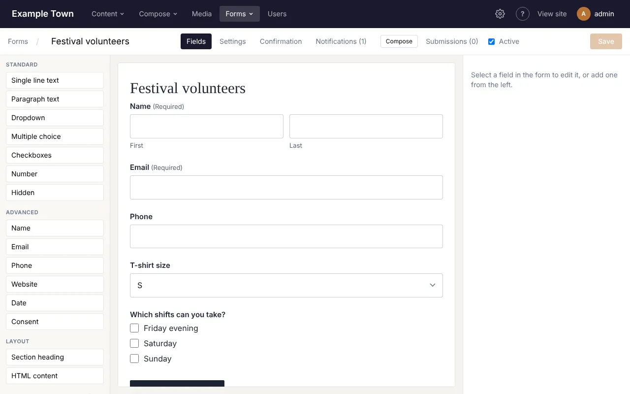
A new form comes ready with a thank-you message and one email to the site’s admin address, so it works as soon as it has fields and is on a page.
The form builder
Section titled “The form builder”Along the top of the builder:
- Forms takes you back to the list.
- The form’s name, which you can click and change.
- The tabs: Fields, Settings, Confirmation, Payment (only on sites that take card payments, see Taking payments) and Notifications (with how many there are).
- Compose, to have Claude write the form (see below).
- Submissions, with how many there are, which opens what people have sent through this form.
- Active: untick it to switch the form off. An inactive form disappears from every page it’s on and takes no answers, but nothing is deleted. Tick it again (and save) to bring it back.
- Save. Beside it you’ll see Unsaved changes, Saving… or Saved. If you try to leave with unsaved changes, your browser asks you first.
The middle of the screen is a live preview of the form, drawn with your site’s own styles. A field that only shows in some cases (see Showing fields only when needed) has a small Conditional label, and a hidden field shows as a dashed box.
Adding and arranging fields
Section titled “Adding and arranging fields”- Add a field: click its type on the left (it goes below the field you have selected), or drag it into the form.
- Move a field: drag it to its new place in the preview, or select it and click Move up or Move down.
- Copy a field: select it and click Duplicate.
- Remove a field: select it and click Delete. If another field’s show or hide rule depends on it, you’re warned first.
Field types
Section titled “Field types”The field types are in groups on the left.
| Field | Use it for |
|---|---|
| Single line text | Short answers, such as a business name. |
| Paragraph text | Longer answers, such as a message. |
| Dropdown | Picking one option from a list that drops down. |
| Multiple choice | Picking one option, with all the options shown as round buttons. |
| Checkboxes | Ticking any number of options. |
| Number | A number, optionally between a smallest and largest value. |
| Hidden | A fixed value the visitor never sees, saved with each submission (set it as the field’s Default value). |
| Name | First and last name boxes side by side, with optional prefix, middle name and suffix. |
| An email address. It must look like name@example.com. | |
| Phone | A phone number. |
| Website | A web address. It must start with https:// (or http://). |
| Date | A date, picked from a calendar. |
| Consent | A single tick box such as “I agree to the privacy policy”. |
| Product | Something the visitor pays for (only on forms that take payment). In the Pricing group. |
| Section heading | A heading, with optional text under it, to break up a long form. |
| HTML content | A block of your own text or HTML shown inside the form, such as a note. |
Standard holds Single line text to Hidden, Advanced holds Name to Consent, Pricing holds Product, and Layout holds Section heading and HTML content.
A field’s settings
Section titled “A field’s settings”Select a field in the preview to see its settings on the right. At the top you’ll see its type and its short code (such as f3), which the site uses to tell fields apart. Which settings appear depends on the type:
- Label: the question, shown above the box. (For a Hidden field it’s Name (only you see this); for a Section heading it’s Heading.)
- Description: a hint shown under the box (for a Section heading, Text under the heading).
- Checkbox text (Consent): the words beside the tick box.
- HTML (HTML content): the text or HTML to show.
- Required: the form won’t send until this is filled in. Required fields show (Required) after their label.
Input (for fields people type into):
- Placeholder: example text shown faintly in the empty box. On a Dropdown this is First option (placeholder), the line shown before anything is picked.
- Default value: what the box holds to start with. For a Date, type it as YYYY-MM-DD.
- Maximum characters (Single line and Paragraph text): the longest answer allowed. Visitors see a counter as they type.
- Minimum and Maximum (Number): the smallest and largest number allowed.
- Format (Phone): US: (###) ###-#### formats the number as people type and needs 10 digits; Any takes any phone number, such as an international one.
Layout:
- Width: how much of the row the field takes: Full width, Three quarters, Two thirds, Half, One third or One quarter. Put two Half fields one after the other to have them side by side, for example first name and email. On phones every field is full width.
- Description above the input: show the hint between the label and the box instead of under it.
- CSS class: a style name your site’s designer may give you. Leave it empty otherwise.
Validation:
- Error message: what visitors see when the field is missing or not filled in properly. Leave it empty for the standard wording, such as “This field is required.” or “Enter an email address like name@example.com.”
Name fields also have Parts (and their labels): tick Prefix, Middle or Suffix to add those boxes, and type a different label for any part. First and last always show.
Choices
Section titled “Choices”Dropdown, Multiple choice and Checkboxes fields (and Product fields with a choice of prices) have a list of Choices:
- Type in a box to change a choice’s wording.
- The small round button or tick box in front of a choice makes it Selected by default. Click it again to clear it.
- Up and Dn move a choice; x removes it (you’re warned if a show or hide rule uses it).
- Add choice adds one at the end.
- Edit as list shows all the choices in one box, one per line, which is quicker for long lists or pasting from elsewhere. Click Apply when done, or Cancel.
- Store different values from the labels (e.g. codes): tick this to keep a short code for each choice (for example “M” for “Medium”), which then appears in submissions and emails. A Value box appears beside each choice. In Edit as list, write a line as “Label | value”.
If you change a choice’s wording or value, show or hide rules that use it are updated to match.
Showing fields only when needed
Section titled “Showing fields only when needed”Any field (except Hidden) can show or hide depending on the visitor’s other answers, for example “Which shift?” only when someone ticks “I can volunteer”.
- Select the field and open Conditional logic at the bottom of its settings.
- Click Show or hide based on answers.
- Pick Show or Hide, then all or any (whether every rule has to match, or just one).
- For each rule, pick the other field, how to compare (is, is not, contains, starts with, ends with, greater than, less than) and the answer. For a field with choices you pick the answer from its list.
- Add rule adds another; x removes one. Always show removes the logic altogether.
What happens to a hidden field:
- Visitors don’t see it and don’t have to fill it in, even if it’s Required.
- Anything typed in it before it was hidden isn’t saved, isn’t sent in emails and isn’t charged for (a Product field).
- A field that depends on a hidden field treats it as empty, so whole chains of questions hide together.
If the form needs another field before you can add a rule, the builder says Add another field to show or hide this one based on its answer.
Settings tab
Section titled “Settings tab”- Description (shown under the title where the form is placed): an introduction. It shows only if the Form block has Show the form description switched on.
- Submit button text: the button’s wording (Submit if left empty), for example “Send message” or “Register”.
- Labels: Above inputs, or Left of inputs (wide screens).
- Spam protection (hidden honeypot field): on for new forms. It adds a box that people never see but spam robots fill in; anything sent with it filled in is quietly thrown away. Leave it on.
- CSS class: a style name for the whole form, if your site’s designer gives you one.
What people see after sending (Confirmation tab)
Section titled “What people see after sending (Confirmation tab)”Under After someone submits, choose:
- Show a message: the form is replaced by your Message. Use Insert field value… to put an answer in it, for example “Thanks, {Name:f1}!”. Paragraphs are added automatically, and HTML is allowed.
- Go to a page: pick a page from the list. Draft pages are marked (draft). While the page is a draft, visitors see the Message (until the page is published) instead, so fill that in too. Edit the page opens it in a new tab.
- Go to a web address: type the full address, starting with https://.
Compose at the top of this tab has Claude write just the thank-you message or page (see below).
Getting an email when someone sends the form (Notifications tab)
Section titled “Getting an email when someone sends the form (Notifications tab)”Notifications are the emails sent each time the form is sent. A new form has one, to the site’s admin address. Click a notification to open it:
- Name: for you, so you can tell several apart (for example “To the office”).
- Send this email: untick to pause this email without deleting it. A paused one shows (off).
- Send to: the addresses, separated by commas. {admin_email} is the site’s admin address. To email the visitor, use their email field’s tag (such as {Email:f3}).
- Reply-to: leave it empty, so that replying to the email goes straight to the visitor (the first email field’s answer). Or type another address.
- From name: the name the email comes from. Empty, it’s your organisation’s name.
- Subject: the subject line. Insert field value… adds an answer or other detail to it, such as the visitor’s name.
- Email: click Edit email to design the email itself (see below). A new email lists all the answers.
- Click Save at the top.
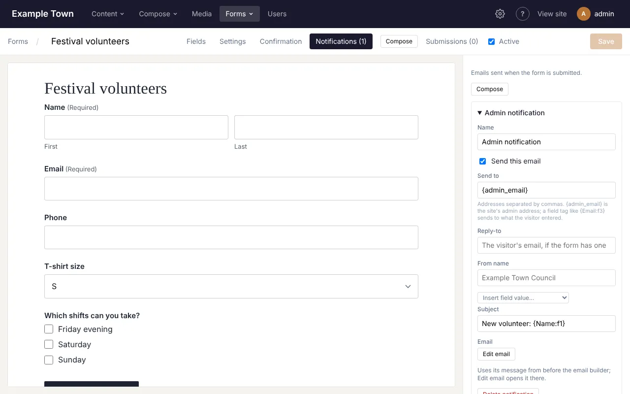
Add notification adds another email, for example a “thanks, we got your message” email to the visitor alongside the one to your office. Delete notification removes one.
If the form takes payment, the emails go out once the payment is complete, not when the form is first sent.
Merge tags
Section titled “Merge tags”The Insert field value… lists add tags in curly brackets, which are swapped for the real details when the email is sent:
| Tag | Becomes |
|---|---|
All fields {all_fields} |
Every answer, as a table (with the total, if the form takes payment). Hidden fields and fields hidden by logic are left out. |
Form title {form_title} |
The form’s name. |
Site admin email {admin_email} |
The site’s admin address. |
Date {date} |
The date it was sent. |
| Payment total, Payment ID, Payment summary | The amount paid, the payment’s reference, and a table of what was bought (forms that take payment only). |
| Each field, by its label | That field’s answer, for example {Email:f3}. |
Designing the email
Section titled “Designing the email”Edit email opens the email builder over the whole screen. It has three tabs, Visual, Plain text and Preview, and at the top right Templates and Done. Changes are saved with the form: click Done, then Save in the form builder.
Visual works like the page editor: drag blocks from the left into the email, click one to change it on the right. With no block selected, the right side shows the email’s own settings: Preview text (after the subject in the inbox), Page background, Email background, Text colour, Link and button colour, Font and Width (px). Buttons above the canvas show the email at Email width or Phone width.
| Block | What it does |
|---|---|
| Heading | A heading, in Large, Medium or Small. Field tags are allowed. |
| Text | Formatted text: bold, italic, bulleted lists and links, with Insert field value… for tags. |
| Button | A button with a label and a link (a web address, mailto:, a /path on your site, or a field tag). |
| Image | A picture from the media library, with alt text, width and an optional link. |
| Form field | One answer (with or without its label), or All fields (a table). |
| Payment | What was paid for, the total, and optionally the status, provider, payment ID and date. Shows nothing for a form that doesn’t take payment. |
| Events | Your next upcoming events, or events you pick (only when your site uses Events). |
| Section | A coloured box to group other blocks, with padding and rounded corners. |
| Two columns | Two blocks side by side. On phones they stack. |
| Divider | A thin line. |
| Spacer | Empty space of a height you choose. |
In the Visual tab, answers show as highlighted stand-ins such as “Email answer”, and the Payment block shows one of each product as a sample.
Plain text is the version for mail apps that don’t show designed emails. Leave it empty and it is made from your design when the email is sent. To write your own, click Fill from the visual design and edit it, or type it from scratch with Insert field value…. Clear empties it again. A plain text of your own doesn’t list Events blocks’ events, so leave it empty if your email has one.
Preview shows the email exactly as it would be sent: who it goes To, the Reply-to, the Subject, the email itself (Desktop or Phone width) and its plain text on the right. Under Answers from, pick Sample answers or one of the form’s real submissions. If no address would receive it, the preview says No valid address: this email wouldn’t be sent.
Email templates
Section titled “Email templates”Click Templates in the email builder to reuse a design across forms:
- Save as template: type a Template name and click it to save this email’s design and plain text for later.
- Use: replaces this email with the template (it asks first).
- Save over it: replaces the template with this email.
- Delete: removes the template. Emails made from it keep their design.
- Default for: choose New form notifications to make new forms, and notifications you add with Add notification, start from this template. Only one template can be the default.
Having Claude write it
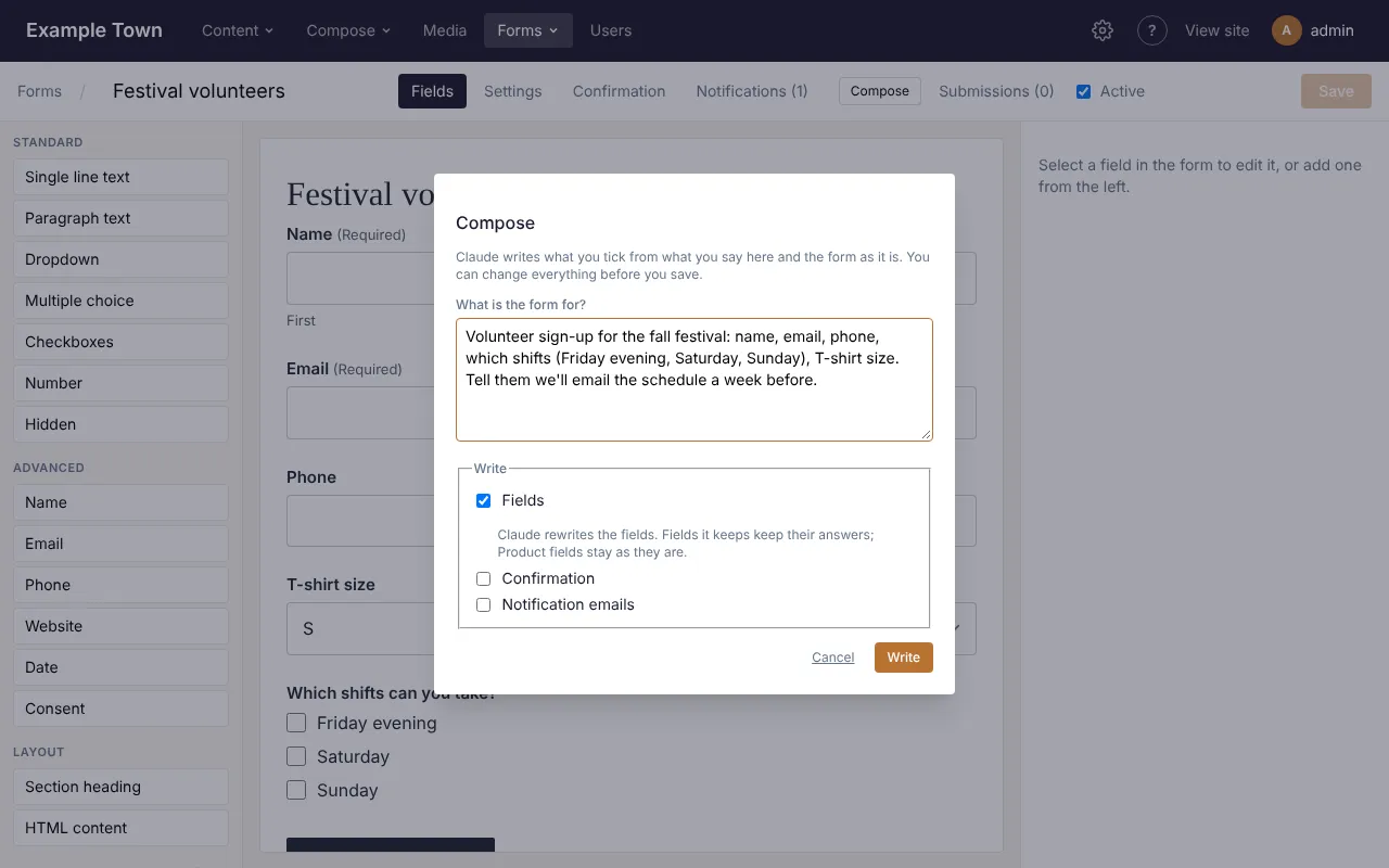
Section titled “Having Claude write it”Click Compose at the top of the form builder and say what the form is for, for example: “Volunteer sign-up for the fall festival: name, email, phone, which shifts, T-shirt size. Tell them we’ll email the schedule a week before.” Then tick what Claude should write:
- Fields: the questions, with sensible widths, hints, choices and show or hide rules. If the form already has fields, Claude rewrites the list: fields it keeps keep their answers and settings, and Product fields stay as they are (Claude never writes prices).
- Confirmation: A message, or A thank-you page (made as a draft). The page is built in your site’s style and hidden from search engines and the site’s search. Open it with Edit the page on the Confirmation tab, check it and publish it. Until then, people see the message.
- Notification emails: the email to you, and a “thanks, we got it” email to the visitor when the form asks for their email address. They replace the existing emails, but each keeps the addresses, reply-to and from name of the one it replaces, and its look.
Click Write. It says Writing… this takes up to a minute. When it’s done, the builder shows what Claude wrote. Read it, change anything you like, then click Save: nothing is saved until you do. Cancel closes the box without writing anything.
The Confirmation and Notifications tabs have their own Compose button, for just that part.
If Claude couldn’t do something, a note appears above the settings, for example that an email to the visitor wasn’t added because the form has no Email field. Click Dismiss to hide it.
You can also start a new form this way: click Compose in the top bar, then Form, give it a name, say what it’s for, tick what to write and click Send. The form is made, opens in the builder and Claude writes it straight away. See Writing with Claude.
Putting a form on a page
Section titled “Putting a form on a page”- Open the page in the editor.
- Drag the Form block (in the Sections group) onto the page.
- With the block selected, choose your form from the Form list on the right. Inactive forms are marked (inactive). Manage forms opens the Forms list in a new tab.
- Switch on Show the form title and Show the form description if you want them above the form.
- Publish the page.
The same form can be on several pages. Changes you save in the form builder show on every page at once.
Changing the form’s look
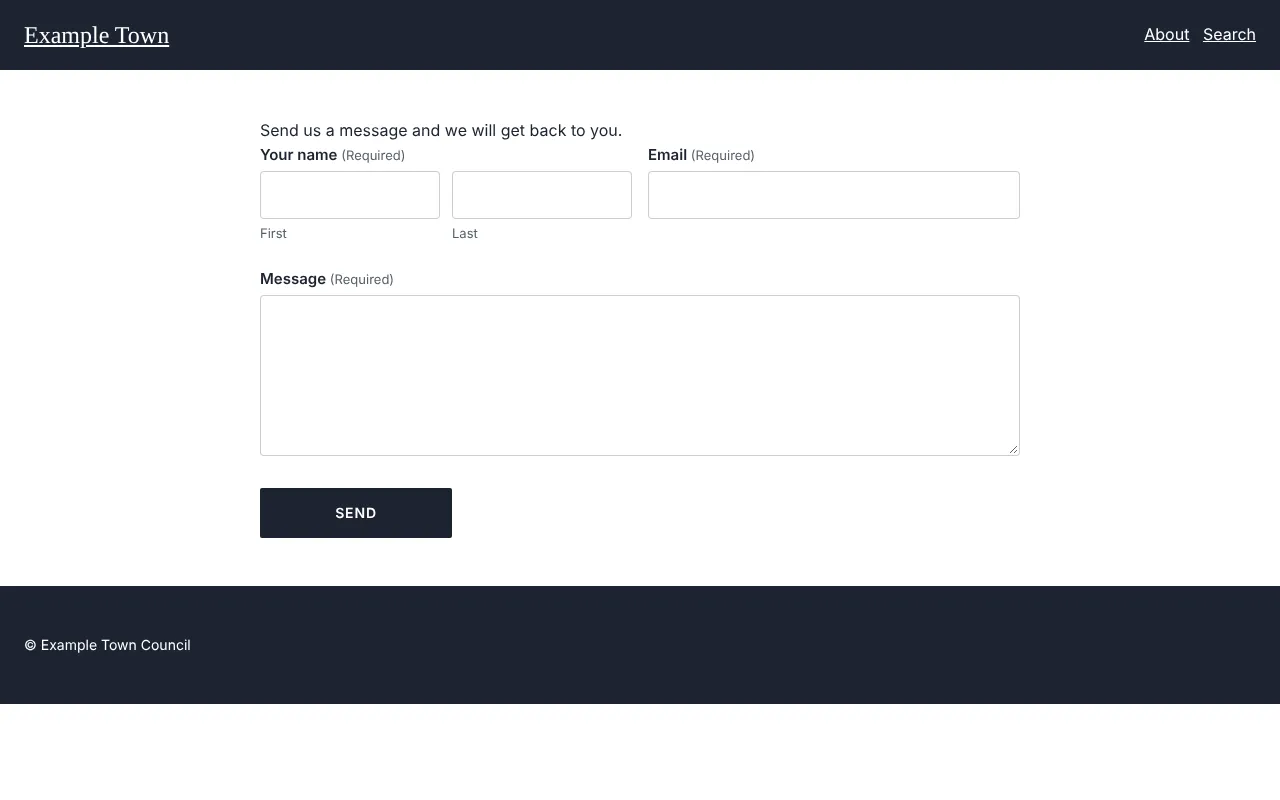
Section titled “Changing the form’s look”By default fields are white with black text, and labels take the colour of the section around them. Open Form style in the Form block’s settings to change:
- Form background (default none) and Form border (default none): either one puts the form in a box with some space around it.
- Form text (heading, intro, small print).
- Field background (default white), Field text (default black), Field border and Placeholder text.
- Labels.
- Button background and Button text.
- Field being typed in (border and ring).
- Checkboxes and radio buttons.
- Field height: Normal, Compact or Large.
- Field text size: Normal, Small or Large.
- Field border width: Thin (default), None, Medium or Thick.
- Field corners and Button corners: Default, Square, Slightly rounded, Rounded or Pill.
Leave a setting empty to keep the default. Check that text stays easy to read against its background.
What visitors meet
Section titled “What visitors meet”- Answers are checked when the form is sent. If something is missing or wrong, the form comes back with the visitor’s answers kept, a message at the top (“There was a problem with your submission…”) and the problem fields highlighted.
- Very long answers are cut at 10,000 characters.
- Spam protection works without visitors doing anything: there’s no puzzle to solve.
- To stop floods, one form takes at most 20 submissions a minute from everyone together. Past that, visitors see “This form is receiving too many submissions. Please go back and try again in a minute.”
Reading what people sent
Section titled “Reading what people sent”Click Forms, then Submissions, in the top bar (or Submissions in the form builder). The newest are at the top, each showing its first two answers and when it was sent (and, while all forms are shown, which form it came from). The screen shows the latest 500.
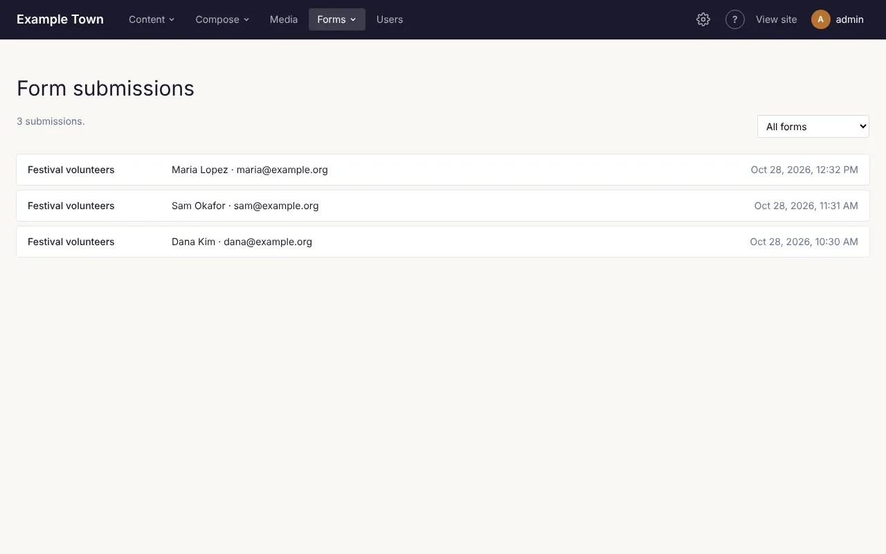
- All forms: pick a form to see only its submissions. Two buttons then appear: Export CSV and Edit form.
- Click a submission to read it in full: every answer, its payment if there is one, and Sent from (the page it was sent from).
- Reply by email (when one of the answers is an email address) opens your email program.
- Delete removes the submission after asking. This can’t be undone.
To download all of a form’s submissions as a spreadsheet (for Excel or Google Sheets), pick the form from All forms, then click Export CSV. It has a Submitted column (the date and time), then one column per field. For forms that take payment it adds Payment, Amount, Currency, Provider and Payment ID. Answers that start with = + - or @ get an apostrophe in front, so a spreadsheet treats them as text, not formulas.
Taking payments
Section titled “Taking payments”A form can also take money, for example a donation, a registration fee or an order. An admin first connects Stripe or Square under Settings (see Connections). Until then the Payment tab and the Pricing fields don’t appear.
Setting up payment
Section titled “Setting up payment”- Open the Payment tab and tick Take payment. The tab then reads Payment (on).
- If both Stripe and Square are connected, choose one under Take payment with. With one, the tab says which it uses. “(test mode)” means it’s connected with test details, so no real money moves.
- Currency: US dollar, Canadian dollar, Euro, British pound, Australian dollar or New Zealand dollar.
- Description of the payment: shown on the checkout page and the receipt (the form’s name when empty). Insert field value… can add an answer, such as the visitor’s name.
- Receipt email: which email field fills in the checkout and gets the payment provider’s receipt. By default it’s the form’s first email field.
- On the Fields tab, add Product fields for what the form charges (see below). Their total is what the visitor pays.
- Click Save.
The tab also shows a webhook address. It’s for whoever set up payments; you don’t need to do anything with it.
If the tab says No payment provider is set up, ask an admin: until a provider is connected the form refuses submissions that have something to pay.
Product fields
Section titled “Product fields”Add a Product (in Pricing) for each thing people can pay for. Under Price, choose:
- One price: type the Price. Without a quantity, it’s charged whenever the field shows (show or hide rules can hide it).
- A choice of prices: a list of options, each with its own price, shown as a Dropdown or Multiple choice (Show as). In Edit as list, write each line as “Label | price”.
- An amount the visitor enters: for donations or “pay what you can”. Set a Smallest amount and Largest amount if you like.
For One price and A choice of prices, tick The visitor chooses a quantity to let people buy several, up to Most they can choose (100 if left empty). A note under the settings says whether the field is required or optional to pay for.
What happens when someone pays
Section titled “What happens when someone pays”- The visitor fills in the form. A Total above the button adds up as they choose.
- When they click the button, they go to Stripe’s or Square’s secure checkout page to pay.
- Once they’ve paid, they come back to your thank-you message or page, and the notification emails go out.
If they don’t finish paying, they come back to the form with their answers kept and a note that their payment wasn’t completed, so the form wasn’t sent. If the total comes to nothing (for example nothing was chosen), the form is sent straight away without a checkout. A total under 50 cents (or 0.50 in the form’s currency) is refused, because the payment providers can’t take less.
In Submissions, each paid form shows its payment: Unpaid (sent to checkout but not paid), Processing (a payment that takes a few days, such as a bank debit), Paid, Failed or Cancelled (the checkout ran out unpaid), with the amount, each item, Paid with, the Payment ID and when it was Paid. Test payments are marked “(test)”.